
7 Signs Your Business Website Is Losing You Customers
Slow load times, outdated design, and broken mobile layouts quietly cost businesses enquiries every day. Here's how to spot the warning signs early.
In This Article
A website can remain online for years while quietly becoming less useful. Customers may struggle to understand the offer, pages may load slowly, forms may fail, or the mobile experience may feel broken. These problems do not always look dramatic to the business owner because internal teams already know the company. New visitors do not have that context. They judge the website quickly and decide whether to continue, leave, call, or contact a competitor.
Key Points
What you need to know
Slow loading
Large assets and unnecessary scripts can create a poor first impression.
Poor mobile experience
Buttons, forms, navigation and layouts should work comfortably on small screens.
Unclear messaging
Visitors need to understand the service and value proposition quickly.
Outdated information
Old offers, prices, contact details or branding reduce confidence.
Weak calls to action
Important pages should make the next action obvious.
Missing trust signals
Reviews, case studies and clear business information can reduce hesitation.
No measurement
Analytics and conversion tracking help you understand what the website is actually doing.
1. Your website loads slowly
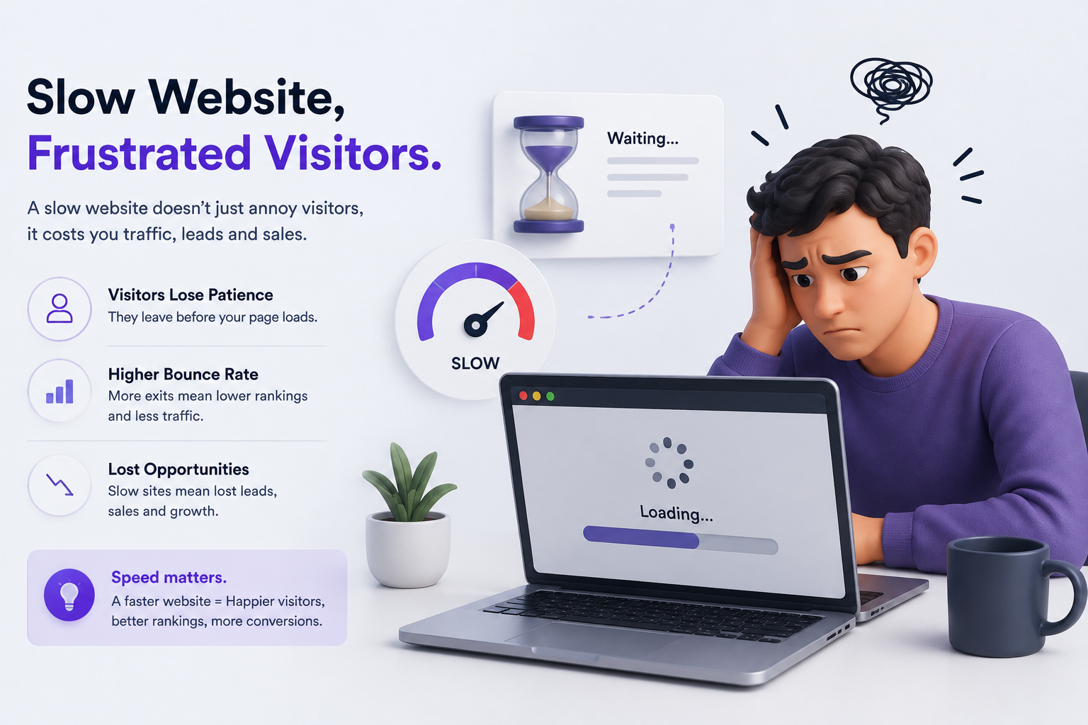
Speed is one of the easiest ways to create friction. Large images, unnecessary scripts, poor hosting configuration and inefficient code can delay the first meaningful experience. If visitors are waiting before they can understand your offer, some will leave before reaching your contact page. Test important pages on real mobile devices rather than relying only on a fast office connection.
2. The mobile layout is difficult to use
A modern business website needs to work on phones, tablets and desktops. Tiny text, cramped buttons, horizontal scrolling, overlapping elements and difficult forms create immediate frustration. Mobile visitors should be able to navigate, read, tap and submit an enquiry without zooming or fighting the interface.
3. Visitors cannot understand what you do
A beautiful homepage can still fail if the message is vague. Visitors should quickly understand what the business offers, who it serves and what makes it useful. Avoid relying on internal jargon. Strong headlines, supporting copy and clear service descriptions reduce uncertainty.
4. Your design looks outdated
Design trends are not the main issue; trust is. If a website looks neglected, has inconsistent spacing, low-quality imagery, broken sections or old information, visitors may assume the business itself is not keeping up. A refresh should improve clarity and credibility rather than simply adding visual effects.
5. Contacting you is harder than it should be
If a visitor wants to ask a question, they should not have to hunt for a phone number or search through the footer for a form. Use clear calls to action throughout important pages. Depending on the business, useful actions may include call, WhatsApp, enquiry form, booking or quote request.
6. There is no evidence that customers trust you
People often want proof before contacting an unfamiliar company. Reviews, testimonials, case studies, client logos, useful business information and clear policies can reduce uncertainty. Trust signals should be genuine and specific rather than exaggerated marketing claims.
7. The website is not helping your marketing
A website should support search, advertising, social media and direct referrals. If pages are not structured around useful search topics, tracking is missing, landing pages are weak or content is difficult to update, marketing efforts can become harder to measure. A modern website should be built to work with the rest of your digital strategy.
How to decide whether you need a redesign
Not every problem requires a complete rebuild. Start by auditing speed, mobile usability, messaging, navigation, forms, analytics, SEO basics and conversion paths. If the foundation is sound, targeted improvements may be enough. If the platform is difficult to maintain or multiple critical problems exist, a redesign can be more efficient.
Final thoughts
Your website is often the first interaction between a potential customer and your business. Fixing friction does not require endless features. It requires a clear message, reliable performance, mobile usability, visible trust and an easy next step. Audit your current site from a new visitor's perspective and prioritise the problems that can directly affect enquiries.
How to audit your current website before rebuilding
Before committing to a complete redesign, perform a simple audit. Open the site on several phones and try to complete the most important task a visitor would have, such as requesting a quote or booking a consultation. Check how quickly the page becomes usable, whether the headline explains the service, whether navigation is obvious and whether every form works. Look at your analytics to identify pages with high exits or weak conversion rates. Review your search visibility and check whether important services have useful landing pages. Ask a few people who are unfamiliar with the business to describe what they think the company does after visiting the homepage. Their confusion can reveal messaging problems that are invisible to the internal team. This evidence helps you decide whether the business needs a complete rebuild or a focused round of improvements.
What a successful redesign should improve
A redesign should have measurable goals. Instead of saying that the new site should simply look modern, define outcomes such as faster page loading, better mobile usability, more completed enquiries, clearer service discovery or stronger organic visibility. Preserve useful content and URLs where appropriate rather than changing everything without a reason. Build reusable components so future pages remain consistent, and test forms, navigation and tracking before launch. After launch, compare important metrics with the old site and collect feedback from customers and staff. A successful redesign is not judged only by screenshots. It should make the website easier to understand, easier to use and easier for the business to manage.
Look at the website through a customer's eyes
Business owners naturally know their own services, terminology and history. Visitors do not. A useful review therefore starts with a simple question: if someone discovers this website for the first time, can they understand the offer without asking for help? Check the first screen, service navigation, pricing or quote information, proof, contact options and mobile experience. Then complete the main conversion action yourself. Look for unnecessary steps, confusing wording and places where the visitor has to guess what happens next. Ask customers which information they looked for before contacting you. Their answers can reveal gaps that a design-only review will miss. A redesign should remove these points of uncertainty and make the path from discovery to enquiry more natural.
Yorra Tech
Ready to turn your digital presence into a growth tool?
Tell us about your business, your goals, and what you want your website or digital system to achieve.
Start a Project